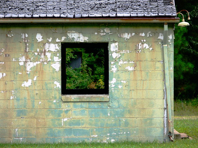
People have asked me about the name for this site. Those who have made inquiry into the underlying processes of photography will likely have run across something called "18% gray". 18% gray is a step on a scale of grays 18% of the distance between 100% white and 100% black. Within early black and white photography it was believed to be a good approximation for the rendering of an average white person's skin tone in average light. The concept became a reference after light meters were invented for the reflectance of an average white person's skin. Instead of walking all the way over to the subject and putting a light meter in their face, a photographer could set the camera and scene before the subject even arrived by metering an 18% gray card. When color photography came along the problem of translating what was perceived by the eye into what could be rendered by film took on a whole new range of issues. The brain automatically makes compensations for changes in the color of light. Film does not. What looks to the eye like a white wedding dress may be seen by color film as pink or light blue or even lime green depending on the qualities of ambient light. Truth became something in the eye of the beholder, not a direct translation of physical reality. Including an 18% gray card in an image now and again was thought to provide a reliable clue during processing as to what the perceived truth may have been at the time. But it was only a clue. Like poking your finger into a balloon and seeing the overall shape change, colors as rendered by film processes do the same. Get the colors for an 18% gray card looking good and the overall scene highlights may look too cyan while at the same time the shadows could look too red or too yellow-green. Not perceptually true and not an easy problem to solve photographically. A further difficulty occurs within color photography when the final print is viewed. While the photo lab may get all the colors to look right under their lights, there is no guarantee the clients will be pleased when they view the final print under their lighting conditions. Color dyes look different under differing light sources. Blue sky daylight is the standard, but few artificial light sources accurately match the rendering of colors in daylight. If you've ever purchased an article of clothing only to realize when you get it home that its color is greenish-gray or pinkish-gray instead of bluish-gray, you know what I mean. Viewing an 18% gray card under a specific light source can suggest some of the error being introduced because neutral gray is equally absorbent and reflective of all colors in the natural spectrum. Colors look weird when not all portions of the spectrum are present in the light source. Black light is an obvious example. Similar problems occur with color computer monitors. What appears to be a neutral 18% gray on a calibrated Apple LCD monitor may not look so neutral or so 18% on an uncalibrated video PC monitor. Setting your monitor to millions of colors, a color temperature of 6500ºK, and software to using embedded ICC profiles should help get you looking at colors closer to what others are intending. It's a tricky business, but overall the industry is making considerable progress toward standardization that hopefully will in the end have most of us looking at the same shade of gray. You may or may not have noticed that there are two versions of this website, white and gray. See the buttons at the bottom of the page to make a switch. Please enjoy the variation. And yes, for purposes of this site I prefer the British "ey" spelling to the more pedestrian "ay" spelling. May all that you truthfully express be perceived as intended. |
• Posted: Jul 23, 2008 22:30:37
• Comments Welcome
• Vote CoolPhotoblogs
• Purchase a Print
• Share
Friday, August 11th, 2006 Richmond VA USA |